The Simple Stories' Simple Vintage Garden District collection is filled with beautiful flowers, birds and butterflies. All of the elements in this collection works so well together. It really is beautiful.
To begin, I cut the Turquoise/Ivory Basic Paper to measure 8 1/2x11. Then I cut the Never Stop Dreaming Paper to measure 7 1/2x10. I matted the Never Stop Dreaming Paper to the center of the Turquoise/Ivory Basic Paper. When I cut the floral paper, I was very careful where I cut because I wanted to keep the flowers and trim the white space from the patterned.
I was undecided as to whether or not I wanted to go with the color photo or the black and white. In the end, I settled with the black and white for this layout.
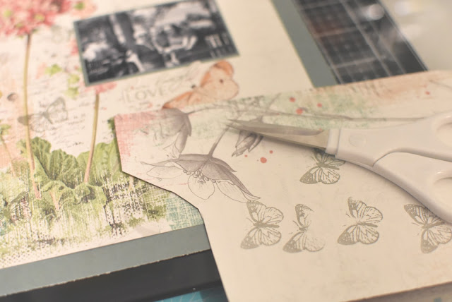
Since I wanted to add a few more butterflies, I used Catherine Pooler's Twilight ink to stamp the butterflies from the clear stamp set that came with this collection. The color matches the gray on the paper perfectly!
I made a mistake when I stamped this stamp onto the paper...it smeared and some of the letters did not ink properly. To fix this, I stamped the image on a scrap piece of patterned paper and cut the image out using scissors. Then I glued it over top of the initial stamped image. You can barely tell!

Before I stamped the butterflies all over the paper, I tested the ink on a scrap piece of paper to make sure the color would look ok. It was perfect. It is almost the same shade as the gray flowers.
I cut these flowers out to use on the layout. Then I framed the photo using the flowers on the right-side of the photo.
I arranged a variety of flowers and leaves onto the layout. Once I was satisfied with the placement, I adhered them down and mounted the matted photo onto the layout.
I tucked a few more flowers here and there and glued the butterflies down. I moved a few additional embellishments here and there until I felt it was complete! I LOVE playing with embellishments. I used a few foam squares to pop up the butterflies from the page to add dimension.
Here are some close-ups of the layout after it was complete. I added a strip of washi at the top and bottom part of the layout to kind of pull the layout together.
Lots of butterflies... I had a hard time knowing how much was too much with the butterflies... I wanted to make sure the butterflies balanced each other out. And that the butterflies weren't too top heavy...
The brads in this collection are beautiful. I managed to add a few on this layout without it looking like it's too much.
What do you think? Isn't this collection absolutely beautiful? I just love it so much! What is your favorite part of this collection? Are you a vintage girl? Even if you're not, this is the perfect collection for scrapbooking those special moments with your family or even your spring photos!


No comments:
Post a Comment